Modern and aesthetic website for a healthcare clinic
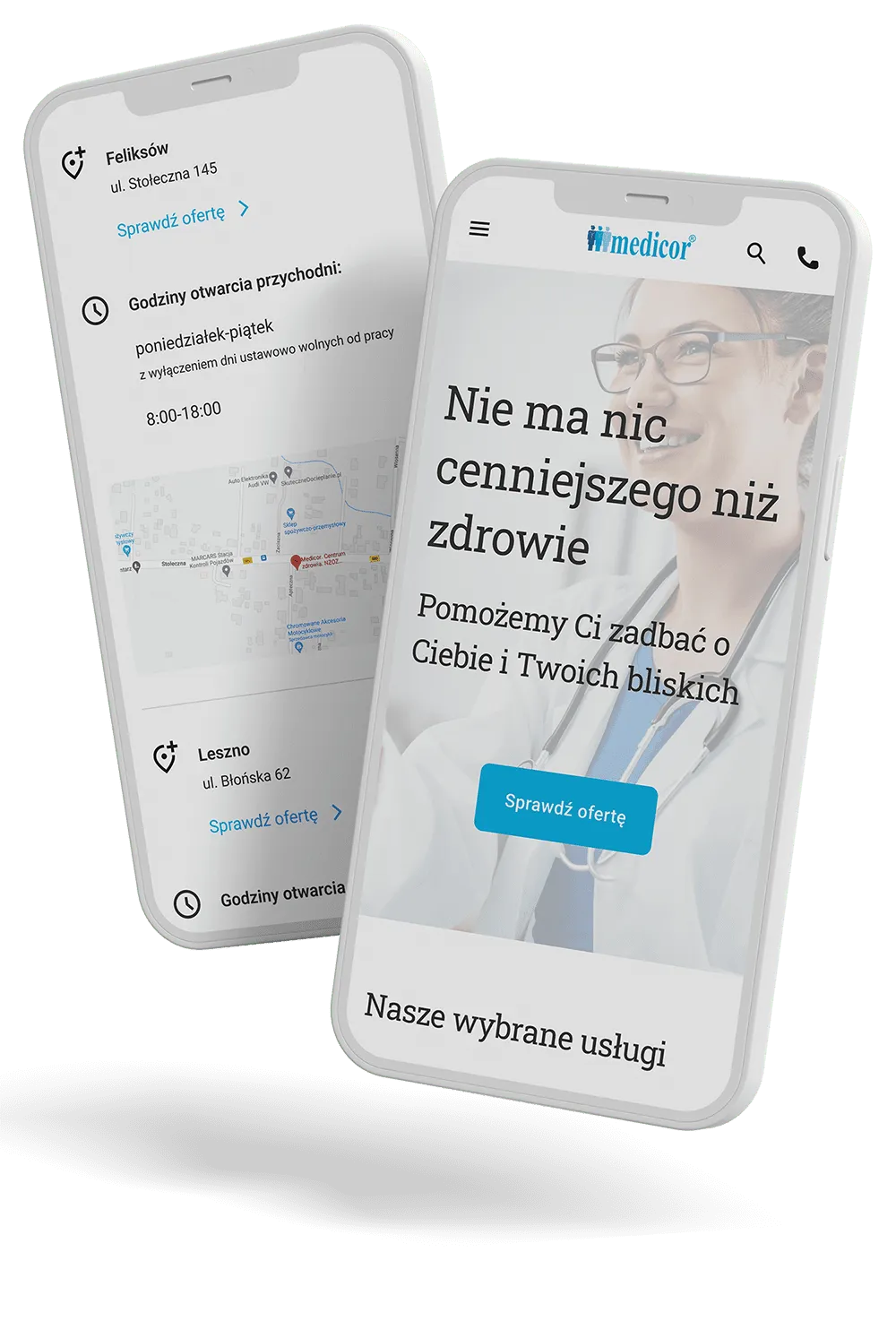
Medicor tasked us with revamping their healthcare clinic website to make it modern, user-friendly, and informative.
TIMELINE: APRIL 2022 - PRESENT
COUNTRY: POLAND
Medicor tasked us with revamping their healthcare clinic website to make it modern, user-friendly, and informative.
TIMELINE: APRIL 2022 - PRESENT
COUNTRY: POLAND


The client entrusted us with website redevelopment. Medicor needed us to redesign and then develop the web app to make it modern, clear and user-friendly.
It was meant to be informative and evoke positive associations with warmth, family, care and comfort. They also needed to update their content effortlessly.

Did you know?
Medicor’s website redesign led to a 64% decrease in ineffective visits, as patients were better prepared for medical examinations.


The main problems we discovered during the first stage of development were that users were easily lost navigating through the website, struggling with finding services and locations and lacking much information.
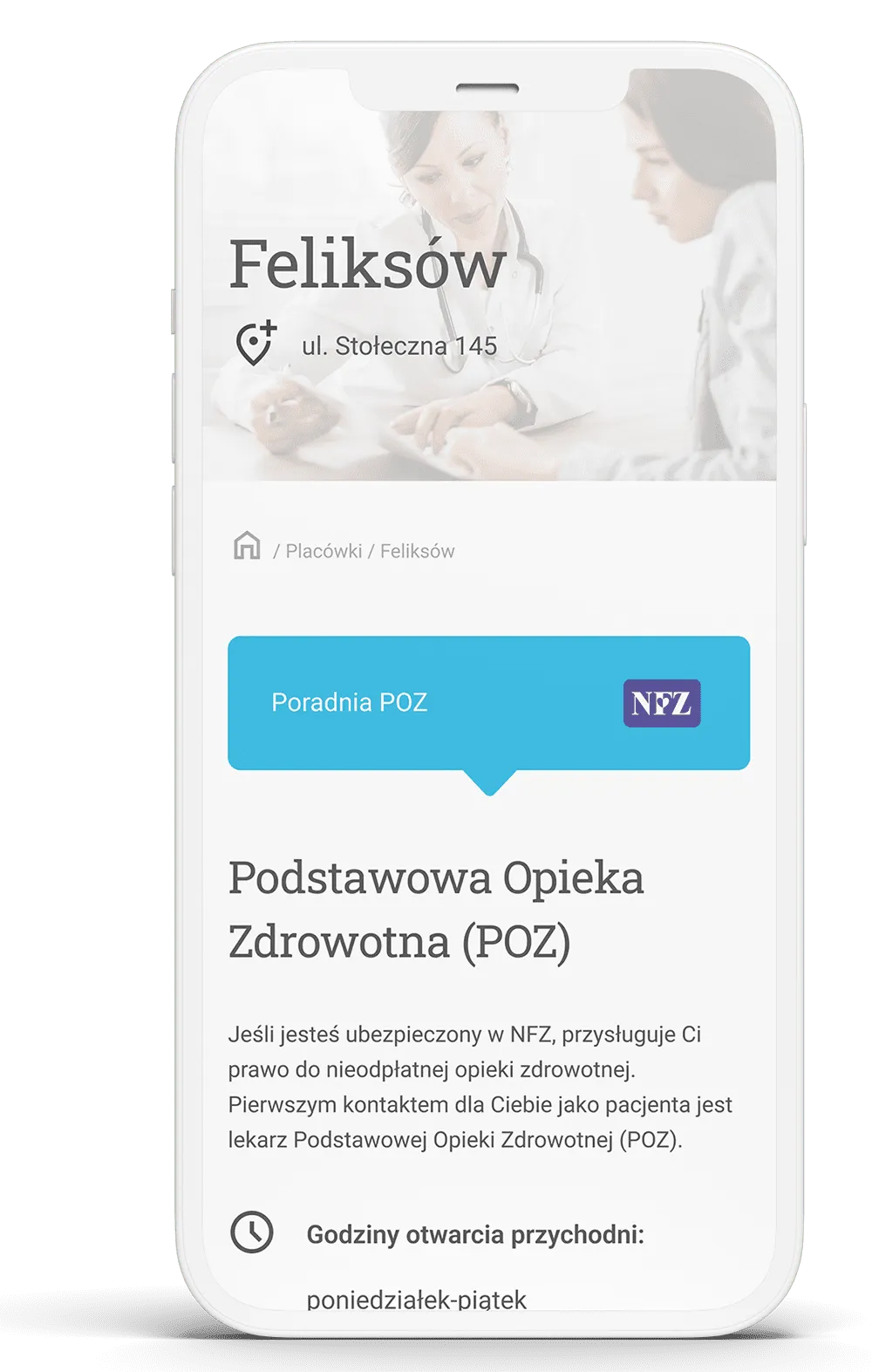
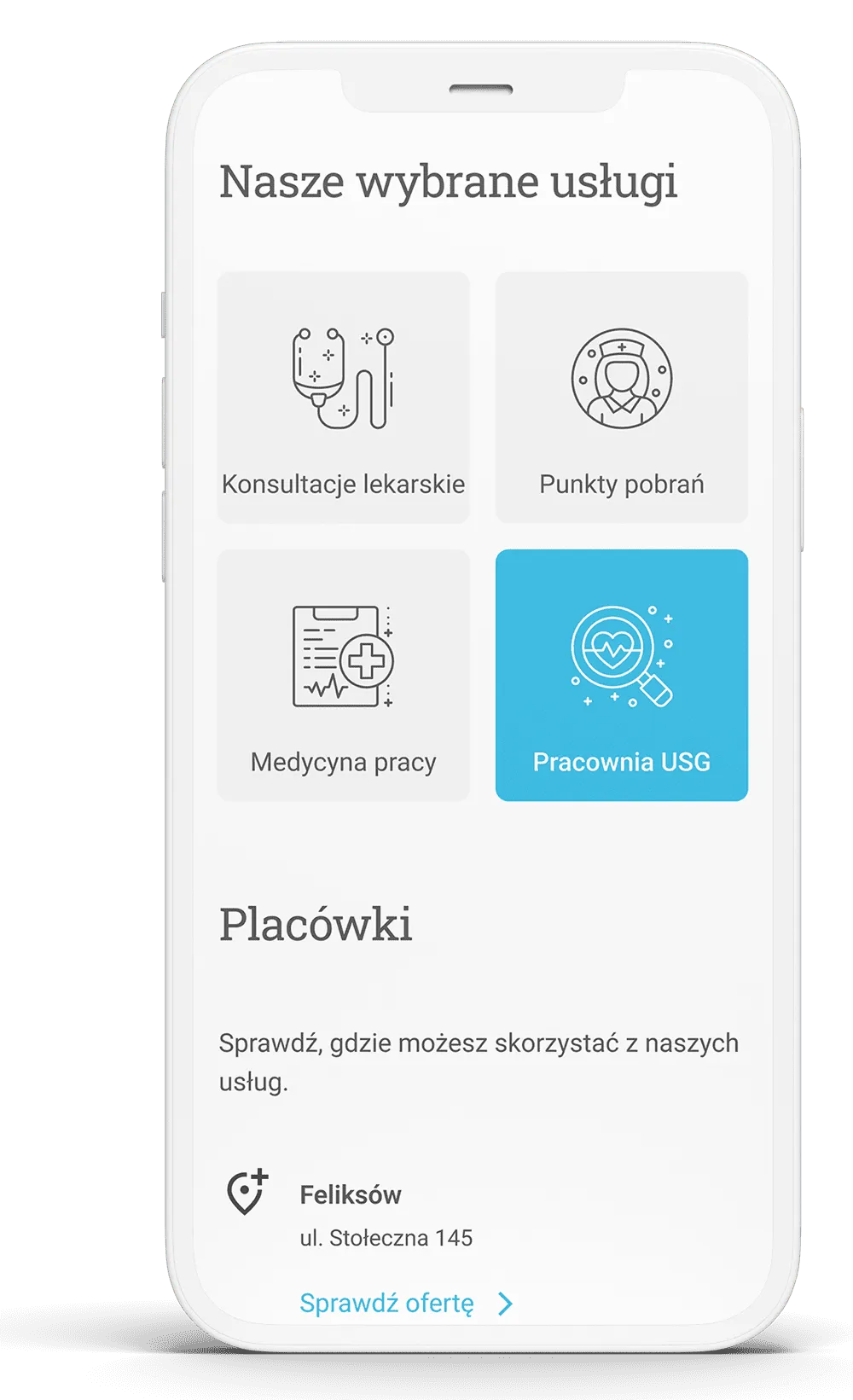
For this reason, we decided to focus on usability and functionality design, creating a straightforward page structure and implementing a clear menu & breadcrumbs navigation, maps, and a search feature. A contact form was also required to allow people to send messages directly from the website.
Medicor needed to provide their clients with more detailed information about preparing for medical examinations, downloadable documents and e-prescriptions, so we decided to create a patient zone.
Another issue was that the website didn’t offer a straightforward tool for content updating, and therefore much information was outdated. For this reason, we needed to implement an intuitive content management system (it must have been in Polish) to help the client keep the website content up-to-date.

Medicor came to us with nothing but the goals defined. They knew what they wanted to achieve, but the question of how to do that was open. They expressed clearly from the very beginning that they need us to lead the project and rely on our experience.
We started the cooperation with a workshop to understand Medicor’s business in detail. Together, we established their goals, current issues and needs.
Basing on them, our business analyst conducted market research by investigating competitors. The main goal was to establish what solutions were widely implemented on similar websites and how they were organised. We were also looking for a unique value proposition for local clients that might convince them to schedule an appointment at Medicor.
Then, we set up another brainstorming session and analysed customers. We needed to discover who they were and what features they needed (and from what we can resign). We listed down the most common user stories. At this stage, we already knew that there was no need to implement online booking solutions or patient portals, but we agreed that placing a phone number in a visible place is functional.


To speed up the process, we scheduled a meeting to build the page structure and wireframes. In such cases, it’s the most effective approach. After the meeting, we created a prototype based on wireframes and conducted user testing to verify whether the structure addressed their needs (we decided not to test wireframes).
After a few fixes, when when we ensured the prototype was exactly what we needed, our designer built a user interface for the app. From the very beginning of the project, we had a lot of independence, and the design stage was no different. At the same time, we were in constant touch with Medicor, so the final meeting during which the client accepted the designs was just a formality.
When our developers started their job, the most challenging part of the project had already been done. They managed to bring the website to life in two weeks. In the meantime, QA engineer was testing the project to discover issues and report them to developers for immediate correction.
When the website was ready, we showed it to a group of users to test it in real life. When they expressed their approval, the app was officially launched. We have been taking care of maintenance since then.
We’ve built a user-friendly website that meets all the requirements. Users are now navigating and finding locations or services with ease. UX-driven redesign and accentuating a phone number caused the conversion rate from phone calls to double.
Because the web app content is currently easily-managed, all information is updated regularly. That affected not only how medical examinations go (patients are better prepared, and the number of ineffective visits decreased by 64%) but also the amount of reception work (the number of emails with repetitive inquiries decreased by 57%).
Additionally, the Medicor website is SEO-optimised and loads in no time. That resulted in gaining better search positions and, therefore, opportunities for attracting new clients without paying for advertising.

