


Cognitive Psychology and Emotions in User Interface Design


Table of Contents:

By clicking this button you agree to receive information from TeaCode about software development and app marketing, the company and its projects to your email. Your data is processed by TeaCode (Postępu 15, 7th floor, 02-676 Warsaw, Poland) to send you relevant content via newsletter (from which you can unsubscribe at any time). You can read more in our Privacy Policy.

We will estimate your project!
Contact Us

Get The Pre-Investment Tech Checklist
Contact Us
Show
Have you ever wondered why the experience on one website is different from the other? What specifically makes some sites unique and pleasant? What lies behind these perceptions, and do other people feel the same way? What are the principles of design psychology?
In this article, we take a closer look at human psychology, cognitive science and processes, emotions, and the fact that understanding these two aspects of the human brain is essential for shaping interfaces that provide a good user experience.
The key points of this article:
- What are the limits of information processing in working memory?
- What is cognitive load and how to prevent it on websites?
- What are Gestalt Principles and how thanks to them we can shape the smooth reception of content on our pages?
- What role does emotional design play and how to give our website personality?
Cognitive Psychology
Cognitive psychology deals with the processes related to the acquisition, storage and processing of information. It covers topics such as memory, attention, concentration, learning, and patterning. Understanding cognitive psychology and internal mental processes plays a significant role in user interface design and user experience design.
Cognitive Functions in Web Design
While navigating websites, the same cognitive processes take place in the human mind as while navigating in the external environment. Of course, they are limited to interacting with the computer, which makes their range and characteristics different. Nevertheless, in order for the information we encounter on websites to reach our cognition, it must pass through the cognitive system.
Being aware of human behaviour, the mechanisms that occur in human perception and the limitations of the human mind, we, as website creators, UX designers and developers, can create our products in a way accessible to human cognition and knowledge acquisition. What are these limitations?
Cognitive Load and Mental Effort in User Experience Design (UX Design)
Cognitive load is a concept that explains how the amount of mental effort required to process information can impact our ability to understand and remember new things over time. It was brought into cognitive psychology by John Sweller during the 1980s.
Effective UX design takes into account the boundaries of cognitive load in order to create user interfaces that are optimised for presenting content. The goal is to ensure that users can quickly grasp and process information.
When the mental effort needed to understand and process information within a digital product goes beyond what the user can comfortably handle (their cognitive load), it’s unlikely that they will continue using the product.
To better understand the problem of cognitive load, first, we have to remember how cognitive psychology works behind the scenes, and in particular how information is stored in long-term memory.
Human Brain Information Processing and Storing
In every second of interaction with the outside world, the human mind undergoes a process of data transfer into our brain (and cognitive psychology talks a lot about this). Some information gets deeper, other instantly disappears from our memory. The way in which information is delivered to the brain is important for further processing of subsequent data and storing them in long-term memory.
One way of understanding memory is to think about it in terms of stages.

Before the information gets stored in our long-term memory, first it has to pass through sensory and working memory. Sensory (ultra-short-term memory) memory includes extracting information from the incoming stimuli in the perception process. The human five senses play a very important role here.
Next, information from sensory memory goes to working memory, where it is processed or discarded. Human cognitive processing is severely constrained by the limits of working memory, which can only take in a limited number of items at a time. This moment is a key aspect of cognitive load. After being categorised in working memory, information moves on to long-term memory, where it is stored in the form of patterns, which then manifest in our perception and behaviour. The capacity of long-term memory and the time of storing items in it are considered to be unlimited.
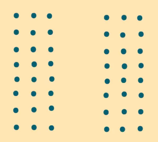
Working memory limitations source
According to The Binding Hypothesis of Working Memory Capacity, working memory helps us put things together and update them quickly. For example, we link objects with where they are, or elements with how we can use them. This helps our mind create and keep track of new things. Working memory is important for reasoning because we use it to think about new ideas. However, our working memory is limited because all these connections can get mixed up, limiting our ability to reason.
Working memory capacity is different for each person and is linked to fluid intelligence. This is our natural speed of thinking and how well our brain cells send messages. Differences in working memory reflect interpersonal abilities and show how effective someone might be at connecting information.
Because memory has a finite capacity, it’s better to steer clear of overwhelming users with extra information that isn’t directly relevant to the main goal. Excessive information can lead users to feel overwhelmed and more likely to give up on a task they’re working on.
Three types of cognitive loads and ways to limit them during the design
Here are three types of cognitive loads and the way they affect user experience:
- Intrinsic refers to the inherent difficulty of the subject matter that is considered fixed. It is a portion of memory that is required to grasp only the essence of a given learning process. It results from the properties of the information and the learning process, not from the properties of the individual.
You can reduce the demands on users’ working memory by:
- breaking content into small but still significant units that can reduce the intrinsic cognitive load of the whole process,
- present content sequentially, and gradually,
- group the content of the page according to its task.
- Extraneous refers to how the brain handles unimportant aspects of a task, like fonts, small actions, or directions. It refers to the part of memory that is occupied by parallel processes not related to the given learning process. It is the extraneous cognitive load the mind uses in the background.
In order to limit extraneous load, you should:
- avoid adding unnecessary and inadequate information (unimportant external stimuli),
- do not distract and split users’ attention,
- keep the visual design and navigation on the website simple and clear,
- keep your story and content coherent,
- organise the content in a logical way, thus reducing confusion on the website and user stress,
- open external links in a new tab.
- Germane refers to a portion of memory dedicated to integrating new data with already stored data, creating and modifying schemas.
Unlike the other two types of cognitive load, the Germane cognitive load should be increased as the user interacts with the website, as this allows us to maximise memory involvement in integrating new information with already existing patterns in the user’s memory. For this, you can use methods such as:
- avoid unproven and innovative ideas that may raise doubts and result in a lack of trust,
- focus on proven and known schemes and interfaces with which the network user is most familiar at the time,
- be aware of the expectations and patterns that the users may be looking for on your site, especially those related directly to the product that the page is about.
When it comes to cognitive load, the best option is to just keep your visual design simple. Don’t expect too much from the user as they may very likely leave your site and not come back.
Gestalt principles of perception
There are also other phenomena from cognitive psychology that can be used in the process of effective web design. One of them is Gestalt psychology and its principles.
Gestalt psychology was proposed in Germany in the first half of the 20th century as an alternative to the then-known and accepted theories of perception. Initially, the focus was mainly on visual perception, but now Gestalt psychology applies to all aspects of human perceiving reality.
The principles of visual gestalt perception concern the mechanism of perceiving content as a whole, with specific properties that differ from the sum of its individual components. For example, the human brain perceives a series of uniform, stationary light bulbs turned on one after the other as a movement, instead of as single points. A similar phenomenon occurs while reading a book. We perceive words and sentences that carry content, not a collection of individual letters devoid of meaning. Individual aspects of the composition begin to be less important in favour of separating the final result of processing the whole.
Why do we need Gestalt principles?
According to Wolfgang Kohler, one of the authors of Gestalt theory, all organic processes tend to evolve to a state of equilibrium.
The human brain leans towards a state of minimal energy utilisation by simplifying how it perceives things. So, when the human brain sees something complicated or unclear, it tries to understand it in the simplest way. This is like soap bubbles that start with different shapes but become round spheres because that is their minimum energy state. This law is called Prägnanz.
Types of Gestalt principles
Figure-ground
The brain distinguishes between the objects it considers to be in the foreground and the background of the image. UX designers need to make sure that elements in the foreground and background are easily recognizable and distinguished to limit cognitive load.

Proximity
The mind perceives different forms depending on the distance between these constituent elements. Objects that are close together seem more connected than those that are far apart. So, if the content on a website has a few different categories, making space between them helps the human brain to differentiate them.
Similarity
Objects that look similar to one another are grouped together, and perceived as a pattern, regardless of their proximity to each other. It can be based on shape, size, and colour.

Closure
The brain is able to perceive a complete shape even if some parts are missing or unclear.

Continuation
The eye naturally follows the lines, curves, or sequences of shapes. The continuation carries human attention.

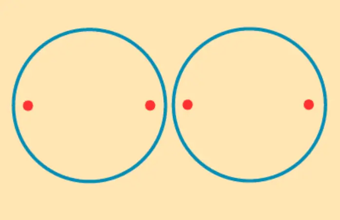
Common region
We perceive elements that are located within the same closed region, such as inside a circle, as belonging to the same group.
Knowing the principles of the visual perception phenomenon, you can easily improve your visual design on web or mobile devices to include smooth and natural interaction, providing a familiar feeling with the page and guiding the user smoothly towards the expected actions.
UX Design Psychological Principles
In the world of UX design, creating interfaces that seamlessly connect with users is both an art and a psychology. Beyond just aesthetics and functionality, UX designers delve into the realm of user psychology to understand how people think, perceive, and interact with digital products.
Psychological principles explain the cognitive and emotional bases of user behaviour, guiding designers in shaping interfaces that are intuitive, engaging, and memorable. In this context, let’s explore some key psychological principles that underpin effective UX design, paving the way for a more user-centred design.
The Hick’s Law
Hick’s Law is one of the crucial psychological principles. It simply summarises what not to do on websites to make them less of a burden for the user when it comes to visual elements and usability.
It states that the time for a user to make a decision increases with the number of available options and alternatives. Basically, if you offer more options and information, it takes longer for users to decide because it adds to their cognitive load.
The Principle of Perpetual Habit
The Principle of Perpetual Habit highlights that people heavily rely on familiar routines and habits. While designing, there’s room for creativity, but some universal standards should stay consistent.
For example, users anticipate finding navigational links at the top and bottom of a webpage. Changing this structure can lead to confusion and a poor user experience.
To address this principle as a UX designer:
- Don’t stray too far from conventional placements. For example, keep the footer at the page’s bottom and side panels on the left.
- Simplify the website’s layout and navigation. Users should be able to understand your website in a couple of visits. Crucial pages should be accessible from the home page with just one click. This helps with both user experience and SEO.
Von Restorff Effect
The Von Restorff effect predicts that among a group of objects, the one that stands out or is different is more likely to be remembered. UX designers leverage the Von Restorff effect when they want to emphasise a key call-to-action button – such as by making it larger or using a distinct colour.
This principle is also valuable in other parts of the user interface. For example, indicating the current tab by using a unique colour, highlighting the current page in navigation, or marking the current step in a user journey all benefit from the Von Restorff effect.
The Principle of Least Effort
This principle underscores that users tend to choose actions that require the least energy. If a product is complex or has a steep learning curve, users might avoid using it.
As a UX designer, here’s how you can address this principle:
Use Examples
Instead of explaining concepts solely through text, demonstrate with real examples, especially during user onboarding.
Concise Text
When using text to explain, keep it concise and meaningful, avoiding unnecessary details or words.
Grouping and Sorting
Group similar information or items, and provide sorting and filtering options. Implement a Search Bar for quick access.
Clear Interactions
Ensure clickable elements like buttons and links are visibly distinguishable. Use hover effects to indicate clickable images. A hover effect occurs when a user moves their cursor over an element, triggering transition effects on it.
Remember, the principle of least effort requires continuous refinement through user testing and iteration, ensuring ongoing improvements to the user experience.
The Principle of Emotional Contagion
The principle of emotional contagion, also known as the chameleon effect, reveals that humans tend to imitate or empathise with the emotions and behaviours of others, including animals and animations.
UX designers can harness this principle to craft captivating and immersive user experiences.
A notable example is Duolingo’s use of the Language Bird. This character responds emotionally, encouraging users to revisit the app. For example, if a lesson is missed, the Language Bird appears upset, while completing a class brings out its cheerful and excited demeanour.
So to address the emotional contagion rule, embrace users’ emotional sides by sharing emotive images or narratives. However, don’t exploit emotional contagion to shame or manipulate users into detrimental actions.
So far, we have focused on cognitive processes related to the perception of the interface, the ability to assimilate its content and remember information and UX design psychology. In the next part of the article, we will focus on another aspect of the functioning of the human mind – emotions.
Emotions
An understanding of emotions is also important in creating designs. They give us a lot of possibilities to improve users’ memory in their experience on the website.
What are emotions?
Emotions are complex reactions, and patterns of response, involving experiential, behavioural, and physiological elements. They are therefore related to the way people deal with the situations they encounter, both internally and externally.
There are three elements of any emotional experience:
- Subjective experience: applies to all factors that evoke emotion. It can be anything: colours, sounds, smells, situations, interactions and lots more.
- Physiological response: all things that happen to our body as a result of the reaction of the autonomic nervous system to an emotion.
- Behavioural reaction: it is an actual expression of emotions in the outside world, e.g. laughter, grimace.
The result of an emotional experience is a feeling. Feeling arises at the moment of classification of emotional experience with the participation of consciousness. They are often long-lasting but can change with time, acquired experiences and beliefs.
Why do we need emotions?
Life without emotions would be dangerous and boring. Emotions warn us of dangers, but also they are our driving force, motivation is born from them. Emotions are fundamentally constructive, they allow us to avoid the mistakes of previous experiences. Understanding emotions allows one to see the truth about oneself and others, build intuition and trust.
Emotions, Memory and Engagement
Emotional experiences make a profound imprint on our long-term memory, they are better remembered. The human brain more often focuses on stimuli with emotional significance than on neutral ones. It focuses and narrows attention to arousal stimuli, and processes emotional data as a priority while reducing attention to peripheral and neutral stimuli.
Over time, memory for neutral stimuli decreases, but the memory for arousing, emotional stimuli remains the same or improves. According to the Mood Congruence Effect, the mood we are in also affects the quality of the information we remember. For example, being in a good and joyful mood increases the tendency to remember events and positive content. It’s similar to recalling memories. We have greater access to content that corresponds to our current mood. What is more, while we are in a good mood, we’re less critical, and the peripheral route plays the main role, which means that we focus on impressions and feelings, hints more than logical argumentation. Poor mood inclines us to focus on details, so we’re more critical and analytical.
Emotions also play an important role in our engagement. When positive emotions are generated, bonding and attachment begin to build, and moreover, thanks to good emotions, trust also begins to emerge.
Emotional design
Undoubtedly, human factors such as emotions play an important role in remembering new content and accessing long-term memory records. The emotional design anticipates and takes into account the needs and reactions of users. It encourages the use of the potential of human positive emotions to provide a better user experience. Also, it is a powerful way to build good memories among users. Thanks to the emotional design the user experience on the website will be perceived as a pleasant meeting with a friend, rather than a duty or boredom.
User needs
What happens if we take Maslow’s pyramid and apply it to the world of user needs? We clearly see some needs of users in relation to the interface with which they interact: functionality, reliability and usability. But there is also a new, missing in Maslow’s theory, an extremely important level of this pyramid – pleasure, which is based on emotional experience.

What then should be the interface that takes into account the needs of users?
- Functional: the interface is to ensure the ability to perform the task with which you come to the site.
- Reliable: the interface should be reliable, and should not allow unexpected errors or system problems that can effectively limit the number of users.
- Usable: the interface should be simple and accessible so that the user can easily reach his or her goal.
- Pleasurable: the interface should provide a pleasant experience and positive emotions. A fun and enjoyable experience translates into greater user engagement and attachment to a particular website. People crave flavour and taste in their user experience!
Human–to–Human interaction
We’re used to classifying the process of UI design into a broad category called Human-Computer Interaction (HCI). However, in order to navigate the idea of emotional design, it is much easier and more beneficial to look at human interaction with the interface as human-to-human interaction.
After all, the computer is just an intermediary, and on the other side are human beings like you who are responsible for the project. This applies not only to the individual but also to the organism which is the whole company or business. Such an individual has a unique and unrepeatable personality, a human side that senses the user’s needs and rises to the occasion to adapt to them and satisfy them.
Becoming Friends with the User
By showing the personality of the platform we create, we can build a relationship with the user. Website is not just a product of zeros and ones or algorithms used to meet others’ needs. Behind the curtains of functionality, usability, and reliability, there are people, and relationships with them can be pleasurable.
By showing this aspect to the user, you give him a chance to treat the product and relate to it as another human being, it allows the emergence of empathy and allows users to see a better vision of their own self.
Persona
You can look at persona in two ways. The first one is the user persona – the archetypical group of users of the product and its key behaviours, whose image helps designers to empathise and better understand the actual users.
The second one is the brand persona – the human aspect of your brand reflected in the design, which allows the user to arouse emotions and establish a relationship with the creator of the product or the product itself.
Creating your brand persona you might consider:
- brand name: name of your service,
- overview: a brief description of the uniqueness of your brand’s personality,
- personality image: a real unit embodying the features you want to emphasise, it can be a mascot,
- brand traits: traits that best describe your brand, including those you want to avoid,
- personality map: a map taking into account the degree of severity of a given trait in the distribution of the X and Y axes,
- voice: a specific aspect of your brand’s voice, e.g. tone, accent, its variability depending on the situation,
- copy examples: examples of phrases that might be used in different situations in your interface. It helps to understand the way your brand’s persona communicates,
- visual lexicon: a visual style that reflects your brand personality, such as colour palette, typography etc.,
- engagement methods: engagement methods that your brand persona can use to provide a positive and memorable user experience.
The results obtained from this type of analysis and plan may vary, depending on the product being created and its intended use. Nevertheless, in the final analysis, both personas (user persona and brand persona) should be matched so that there can be an interaction between them that brings pleasure and benefits to both parties.
Other engagement methods
Giving personality to a brand and creating a persona is a very complex, holistic step in creating an emotional design. However, there are also other methods that can serve a similar purpose. These are among others:
- surprises: a surprise amplifies our emotional response. The moment of surprise compresses emotions, which makes the event better remembered. It also breaks users’ behavioural patterns. Surprises should be positive, kind, and should pay attention to the individual user.
- anticipation: announcing the occurrence of some new event, functionality, opportunity, or simply change can help build audience desire and engagement. Unlike surprise, when the user has time to reflect on the upcoming experience, the emotion builds slowly and binds the user to fantasies about the event.
Both techniques are based on a mechanism called priming. It occurs when an individual’s exposure to a particular stimulus influences their response to another stimulus, without being aware of the connection. For example, positive emotions arising during a surprise, or anticipation, prime his future trust in the product.
Each subsequent positive experience during the user’s interaction with the interface causes the paths between these memories to be activated in memory. The moment the next stimulation arrives on the site, the human mind will want to follow the proven path of reception and build a connection between these experiences. Investing in the user with the use of priming mechanisms can have a very positive impact on their attitude, emotions and engagement. Importantly, we can help users solve problems much easier if they have a positive attitude and feel positive emotions.
Conclusion
In this article, we have focused on several aspects of the functioning of the human mind in light of UX design psychology and web design.
Understanding cognitive psychology and awareness of limitations in human cognitive processing capabilities, the unreliability of his memory, as well as knowledge of visual perception schemes defined in Gestalt principles, can help us create more accessible and pleasant designs which will guide the user smoothly and without any obstacles. Knowledge of the cognitive load phenomenon is crucial for creating accessible interfaces that do not burden the user so that he can easily get the most out of them.
Finally, understanding how human emotions work, how they help to improve and maximise memory processes, and how to provide them with positive and long-lasting memories of interacting with our product will help us further create a comprehensive vision of the project in terms of building a positive relationship with the user and his engagement in our website or application.
Summary of key points:
- Human working memory has limits. These limitations create a cognitive load, which is the result of information interference in the process of constructing and manipulating new cognitive structures.
- Cognitive load has three types, and each of them can be solved in different ways by using design treatments intended for this purpose.
- Gestalt principles reflect the mechanisms of human visual perception. They were created to receive information from the environment with minimal energy expenditure.
- Emotions are a powerful driving force of the human brain. The use of emotional design provides the user with positive experiences, preserves his memories and allows you to build relationships and engagement.
Sources:
- Eysenck, M. W., & Brysbaert, M. (2018). Fundamentals of cognition. Routledge
- Rock, I. i Palmer, S. (1990). The Legacy of Gestalt Psychology . Scientific American, 263(6), 84-91.
- Stangor, C., & Walinga, J. (2019). Introduction to psychology-1st Canadian edition. Retrieved (2019, March) (https://opentextbc. ca/introductiontopsychology).
- Sweller, J., van Merriënboer, J. J., & Paas, F. (2019). Cognitive architecture and instructional design: 20 years later. Educational Psychology Review, 31(2), 261-292.
- UWA online, The Science of Emotion, Exploring the Basics of Emotional Psychology. (2019). (https://online.uwa.edu/news/emotional-psychology)
- Walter., A. (2011) Designing for Emotion. A Book Apart, New York.
- Wilhelm, O., Hildebrandt, A., Oberauer, K. (2013). What is working memory capacity, and how can we measure it? (https://www.frontiersin.org/articles/10.3389/fpsyg.2013.00433/full)
- van Merriënboer, J. J G., Kester, L., & Paas, F. (2006). Teaching complex rather than simple tasks: Balancing intrinsic and germane load to enhance transfer of learning. Applied Cognitive Psychology, 20, 343–352.
- Yeung, A.S., Jin, P., & Sweller, J. (1997). Cognitive load and learner expertise: Split-attention and redundancy effects in reading with explanatory notes. Contemporary Educational Psychology 23, 1-21.
This article was originally published on
August 22, 2024
February 23, 2026

.webp)